A Community Identity
Carlisle is a positive and supportive school where diversity is celebrated. Parents and the school share in creating an environment in which children can grow and experience success. Our new visual identity now reflects this in a contemporary and meaningful way.
Why The Change…
With an ever evolving community our logo has taken shape in many different iterations over the years. Over this time small variances in the logo and motto had emerged and no longer reflected the strong and positive identity the school has to the best of its ability. The school embarked on a journey to develop a contemporary and consistent visual identity that was representative of the vastly diverse and supportive school community we are today. Through consultation with the School Board, students, staff, and families we have created a strong visual identity to usher in the next 100 years of education at Carlisle Primary School whilst maintaining ties to our foundations as a school with a strong sense of community, supporting our young people to ‘Learn and Grow Together‘.
Brand Story
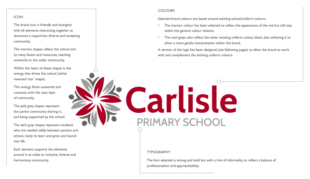
The brand icon is friendly and energetic with all elements interacting together to showcase a supportive, diverse and accepting community.
The maroon shapes reflect the school and its many facets and resources, reaching outwards to the wider community.
Within the heart of these shapes is the energy that drives the school (white reversed ‘star’ shape). This energy flares outwards and connects with the next layer of community.
The pale grey shapes represent the parent community sharing in and being supported by the school.
The dark grey shapes represent students who are nestled safely between parents and school, ready to learn and grow and launch into life.
Each element supports the elements around it to make an inclusive, diverse and harmonious community


